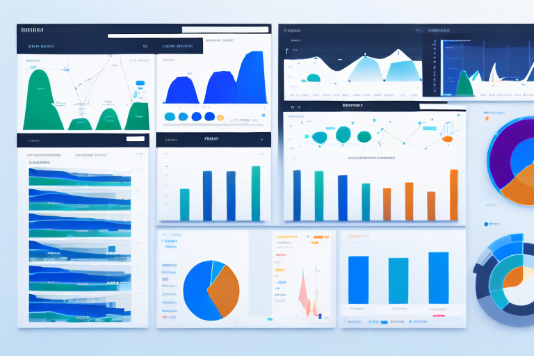
For the past two decades, the corporate mantra has been unequivocal: “We need to be data-driven.” In response, American businesses have invested billions in data infrastructure, analytics platforms, and Business Intelligence (BI) tools. The result? A proliferation of dashboards. From the sleek, real-time displays in operations centers to the weekly performance reports emailed to every manager, we are swimming in more data visualizations than ever before.
Yet, a quiet frustration is brewing in conference rooms and virtual meetings across the country. Teams are left staring at beautifully rendered line graphs, bar charts, and KPI gauges, asking a simple but devastating question: “So what?”
The dashboard, once the pinnacle of data maturity, has become a digital cul-de-sac. It shows us where we are, but it rarely tells us where to go next. It displays the “what,” but is silent on the “why” and the “how.” We have mastered the art of visualization but have neglected the science of decision-making.
This is the critical juncture where American teams now stand. The next frontier of data visualization is not about building more dashboards or even better-looking ones. It’s about forging a direct, actionable, and intelligent link between insight and action. It’s about moving from dashboards to decisions.
The Dashboard Dilemma: Why Our Current Tools Are Failing Us
To understand the future, we must first diagnose the present. The modern dashboard, for all its utility, suffers from several systemic flaws that inhibit effective decision-making.
1. The Passivity Problem
Most dashboards are passive. They are like a street sign you pass on your commute; it provides information, but it doesn’t compel you to act. A sales manager might see that the lead conversion rate for the Central region is down 15%. The dashboard has done its job—it has surfaced the data. But the cognitive burden of diagnosing the root cause (is it a poor marketing campaign? a new competitor? a broken sales script?) and formulating a response falls entirely on the manager. The dashboard is a spectator, not a participant.
2. Information Overload and “Dashboard Blindness”
In an attempt to be comprehensive, dashboards often become overwhelming. A single screen might contain 20 different charts, 15 KPIs, and a color palette that would dazzle a rainbow. This leads to “dashboard blindness,” where users, unable to process the noise, mentally check out. The most critical signals are lost in a sea of data, and the tool designed to create clarity ends up generating cognitive fatigue.
3. Lack of Context and Narrative
Data points in isolation are meaningless. A 10% drop in weekly revenue is alarming, but its significance changes entirely with context. Is this part of a normal seasonal dip? Did it occur after a price increase? Is it isolated to one product line? Traditional dashboards often fail to provide this narrative context. They show the metric but not the story behind it, forcing users to embark on a time-consuming investigation across multiple systems to understand the “why.”
4. The “One-Size-Fits-None” Trap
Many organizational dashboards are built for a generic “user,” which means they are perfectly optimized for no one. The C-suite needs a high-level, strategic view. A marketing analyst needs granular, campaign-level data. A frontline operations manager needs real-time, tactical alerts. When all three are forced to use the same dashboard, it fails to meet any of their specific decision-making needs.
5. The Separation of Insight from Action
This is the most critical failure. In a typical workflow, a user:
- Opens a dashboard.
- Scans the data.
- Identifies a potential issue or opportunity.
- Opens another tool (email, Slack, project management software).
- Manually describes the insight and proposes an action.
This context-switching breaks the flow of decision-making. The insight and the action live in two separate worlds, creating friction and delay.
The Paradigm Shift: From Descriptive to Prescriptive and Augmented Intelligence
The next frontier requires a fundamental shift in the philosophy behind our data tools. We must move up the analytics value chain.
- Descriptive Analytics (The Past): What happened? This is the domain of the traditional dashboard. It uses historical data to describe the state of the business.
- Diagnostic Analytics (The Present): Why did it happen? This involves drill-downs, root cause analysis, and data discovery to understand the drivers behind the metrics.
- Predictive Analytics (The Future): What is likely to happen? This uses statistical models and machine learning to forecast future outcomes.
- Prescriptive Analytics (The Action): What should we do? This is the pinnacle. It recommends specific actions to take advantage of the predictions and insights.
The next generation of data visualization integrates all four layers, but with a laser focus on enabling the prescriptive and moving towards Augmented Intelligence—where AI doesn’t replace human decision-makers but empowers them with superior tools and insights.
Pillars of the Next Frontier: Building for Decision-Centricity
So, what does this new paradigm look like in practice? For American teams to thrive, their data visualization tools must be built on four core pillars.
Pillar 1: Embedded Analytics and the “API of Action”
The future of visualization is not a separate portal you log into; it’s embedded directly into the workflows and applications where decisions are made. This is the concept of the “API of Action.”
Example: Instead of a dashboard showing a spike in customer support ticket volume for a specific product feature, the insight is embedded directly into the product team’s Slack channel or Jira board. More than that, it doesn’t just state the problem; it provides one-click actions: “[Create a Bug Ticket]” pre-populated with the relevant data, or “[Convene a War Room]” that automatically invites the relevant engineers and product managers.
The visualization becomes an interactive agent within the workflow, eliminating the friction between seeing a problem and starting to solve it.
Pillar 2: Narrative Visualization and AI-Powered Context
To combat information overload and a lack of context, visualizations must tell a story. This is achieved through:
- Automated Annotations: Instead of a bare chart, systems will automatically annotate key events. “This spike correlates with the ‘Winter Sale’ campaign launch.” “This dip occurred after a major competitor entered the market.”
- Natural Language Generation (NLG): AI can now write coherent summaries of data. A block of text above a chart might read: “Q3 revenue reached $5.2M, a 12% increase over Q2, primarily driven by a 34% surge in sales from the Southwest region. This exceeds the forecast by 4%.” This instantly provides the narrative that a human would otherwise have to construct mentally.
- Conversational Analytics: The ultimate form of narrative is a conversation. Tools are emerging that allow users to ask questions of their data in plain English: “Show me sales by region for the last quarter, and highlight the region with the highest growth.” The visualization is generated on the fly as a direct response to the query, making the experience interactive and deeply contextual.
Pillar 3: Personalization and Adaptive Interfaces
The “one-size-fits-none” dashboard is obsolete. Next-generation platforms will leverage user identity, role, and behavior to deliver personalized data experiences.
- Role-Based Views: A CEO sees a top-level P&L and strategic health metrics. A marketing manager sees campaign attribution and channel performance. The system presents the same underlying data but curated and visualized for specific decision-making contexts.
- Adaptive Cards: Instead of a static dashboard, imagine a feed of intelligent, data-rich “cards.” One card might alert a warehouse manager to a potential stock-out in a specific SKU, another might suggest a staffing adjustment based on predicted order volume, and a third might highlight an anomaly in shipping times. The user’s homepage becomes a dynamic, prioritized list of insights and recommended actions tailored specifically to their responsibilities.
Pillar 4: Augmented Decisioning with AI Co-Pilots
This is the most transformative pillar. AI and Machine Learning will move from being backend engines to being visible co-pilots within the visualization interface.
- Anomaly Detection with Diagnosis: The system doesn’t just highlight an anomaly in red; it provides a probable cause. “Revenue for Product X is 3 standard deviations below forecast. This is 92% correlated with a negative review from a major industry influencer published on October 15th.”
- Scenario Modeling and “What-If” Analysis: Tools will allow users to interact with the data model directly. “What would happen to our profitability if we increased our marketing spend by 15% and the customer acquisition cost rose by 5%?” The visualization instantly updates to show the projected outcome, enabling data-backed strategic planning.
- Prescriptive Recommendations: This is the culmination. The system provides a clear, ranked list of recommended actions. For a drop in customer engagement, it might suggest:
- Recommended (High Impact): Launch a re-engagement email campaign to dormant users. *[Estimated Impact: +5% Active Users]*
- Consider (Medium Impact): A/B test the onboarding flow for new users. *[Estimated Impact: +2% Retention]*
- Investigate (Exploratory): Analyze support tickets for usability complaints.
The human remains firmly “in the loop,” bringing their intuition, experience, and ethical judgment to the final decision, but they are now empowered with a level of analytical support that was previously unimaginable.
Implementing the Future: A Practical Roadmap for American Teams
Transitioning from a dashboard culture to a decision-centric one is not merely a technological shift; it’s a cultural and procedural one. Here is a practical roadmap for teams to begin this journey.
Phase 1: Foundation – Audit and Align
- Decision Inventory: Before building anything, identify the top 10-20 critical decisions your team makes regularly. Be specific. Is it “weekly pricing adjustments,” “monthly inventory re-ordering,” or “quarterly marketing budget allocation”?
- Tool Audit: Critically evaluate your current dashboards. For each critical decision, ask: Does this tool directly support it? Where are the friction points? How long does it take to go from data to decision?
- Establish a “Decision Owner”: For each key decision, assign an owner responsible for the outcome and for defining the data and process required to make it effectively.
Phase 2: Prototype – Start with a Single Decision
Don’t try to boil the ocean. Select one high-impact, repetitive decision and build a next-generation visualization prototype around it.
- Example: Managing Digital Ad Spend.
- Old Way: A dashboard showing daily spend, CPC, and ROAS by campaign.
- New Way: An embedded tool within the marketing team’s workflow that:
- Uses predictive models to flag campaigns likely to miss their ROAS target in the next 48 hours.
- Uses NLG to explain: “Campaign ‘A’ is forecast to be 20% over budget due to a rising CPC in the ‘Technology’ audience segment.”
- Provides prescriptive buttons: “
[Pause Audience Segment]“, “[Adjust Bid -10%]“, or “[Re-allocate Budget to Campaign B]“.
Read more: Demographics as Destiny: An Equity Analysis of US Healthcare and Senior Living
Phase 3: Scale – Build a Ecosystem of Decision Apps
Once you have a successful prototype, scale the philosophy.
- Empower Citizen Developers: Use low-code/no-code BI platforms that allow business users to create their own adaptive data apps without relying entirely on IT.
- API-First Integration: Ensure your data stack can push insights into communication (Slack, Teams) and project management (Jira, Asana) tools.
- Foster a Culture of Experimentation: Treat decision-support tools as living products. Use A/B testing to see which visualizations and recommendations lead to better outcomes.
Phase 4: Cultivate – Train and Transform
- Upskill Your Team: Data literacy is no longer about reading a chart; it’s about interrogating an AI, understanding probabilistic forecasts, and managing AI co-pilots. Invest in training.
- Promote Data Storytelling: Encourage teams to present their findings not as a series of charts, but as a narrative that leads to a clear decision point.
- Reward Outcomes, Not Activity: Shift performance metrics from “dashboard usage” to “decision velocity” and “decision quality.” Did the team use data to make a faster, better decision that improved the business?
The Human Element: Why the Decision-Maker is More Important Than Ever
In this new world of augmented intelligence, a fear often arises: will this make us obsolete? The opposite is true. The role of the human decision-maker becomes more, not less, critical.
AI can surface correlations and recommend actions, but it cannot understand company values, long-term vision, employee morale, or ethical nuances. The human provides the judgment, creativity, and conscience.
The future team is a symphony, not a solo. The AI is the instrument, capable of incredible speed and precision. The human is the conductor, providing the interpretation, the emotion, and the soul that turns noise into music. The goal is not to automate decisions, but to elevate them.
Conclusion: The Competitive Advantage of Decision Velocity
The next frontier of data visualization is not a technological feature set; it is a competitive mindset. For American teams operating in a fast-paced, global economy, the ability to make high-quality decisions faster than the competition is the ultimate advantage.
The era of the passive dashboard is ending. The future belongs to active, intelligent, and embedded systems that close the gap between insight and action. It’s a future where our tools don’t just show us the world as it is, but help us chart a course for where we want to go. The journey from dashboards to decisions is the most important pilgrimage modern businesses can undertake. The teams that embark on it today will be the leaders of tomorrow.
Read more: ESG in the USA: A Performance and Risk Analysis of Sustainable ETFs vs. Traditional Benchmarks
FAQ Section
Q1: This sounds expensive and complex. Is this only for large enterprises with big data teams?
Not necessarily. While the most advanced AI-powered platforms can be complex, the core principles can be applied by teams of any size. Many modern BI tools (like Power BI, Tableau, and especially newer cloud-native platforms) are building embedded analytics, NLG, and basic anomaly detection into their offerings. The most important first step is cultural: shifting your focus from reporting on data to supporting decisions. You can start small with a single process without a massive investment.
Q2: Won’t prescriptive analytics and AI recommendations lead to “groupthink” and de-skill my team?
This is a valid concern. The key is to design these systems for augmentation, not automation. Recommendations should be transparent, explainable, and contestable. Your team should always ask, “Why is the system suggesting this?” A well-designed tool will provide the reasoning and data behind its suggestions. This actually upskills the team by forcing them to critically evaluate evidence and understand the underlying business drivers more deeply, rather than just accepting a surface-level metric.
Q3: How do we ensure data quality and trust in these advanced systems?
Trust is paramount. The adage “garbage in, garbage out” has never been more relevant. Building trust requires:
- Data Governance: Robust processes to ensure data accuracy, consistency, and lineage.
- Model Transparency: Where possible, AI models should be interpretable. Users need to understand the key factors influencing a prediction or recommendation.
- Feedback Loops: Systems must allow users to provide feedback on recommendations (“Was this suggestion helpful?”). This feedback is crucial for refining and improving the models over time. Start with high-quality, trusted data sources for your initial prototypes.
Q4: What roles on a team are most impacted by this shift?
- Data Analysts/Scientists: Their role evolves from building reports to building decision-support “products” and managing AI/ML models. They become partners deeply embedded in business operations.
- Business Leaders & Managers: They transition from being passive consumers of data to active conductors of an augmented decision-making process. Their judgment is the final arbiter.
- Frontline Employees: They are empowered with real-time, prescriptive insights that allow them to take calibrated actions without waiting for managerial approval, speeding up organizational response times.
Q5: We’ve just invested heavily in a traditional BI dashboard system. Is it obsolete?
Not at all. Your existing BI system is a vital foundation. It contains the data models, ETL processes, and user management that are essential for any advanced analytics. The shift is often about adding a new layer of intelligence and interactivity on top of this stable foundation. Many of these new capabilities can be integrated with your current stack through APIs and embedded analytics features, protecting your investment while modernizing your capabilities.
Q6: What is the single most important thing we can do to get started?
Conduct a “Decision Inventory.” Gather your team and list the most important, repetitive decisions they make. Then, for the top one or two, map out the current process from data to action. You will quickly identify the friction points, manual work, and delays. This exercise alone will illuminate the opportunities for improvement and provide a clear, focused starting point for your journey from dashboards to decisions.


